The icons of an app are tiny in size but play an important role in the success of your mobile application. It is the first thing by which the users’ encounters of your app. Henceforth, the mobile app icon should be intimidating, beautiful, identifiable, and memorable. While creating the app, we do a lot of research for UI & UX, and other functionalities while forgetting about this very first thing. Henceforth, in this guide, we are going to tell you about the necessary tips for creating a wonderful icon. But first, you should be clear about the app icon and why is it so important.
What is Mobile App Icon and Why is It so Important?

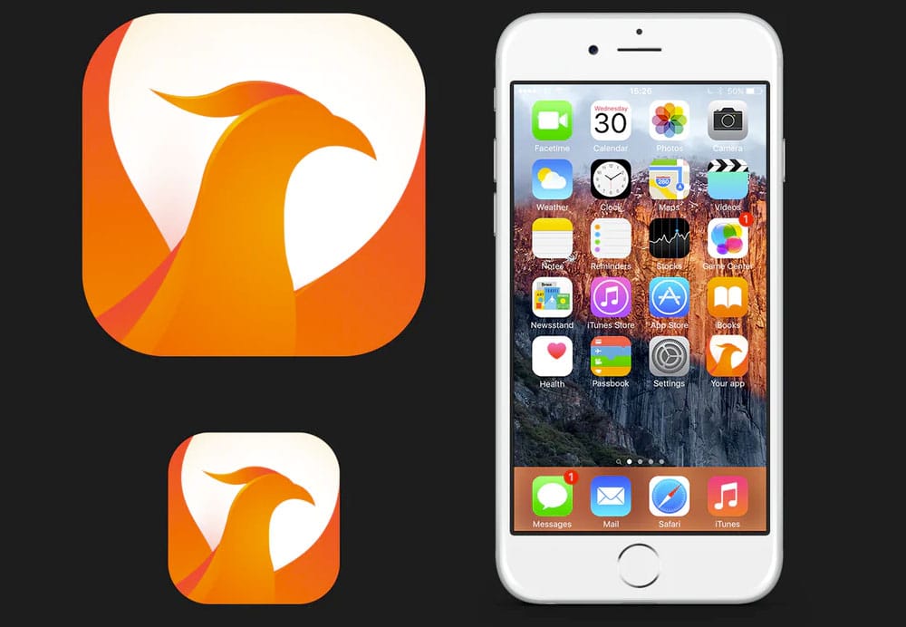
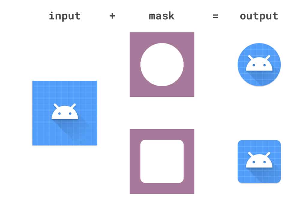
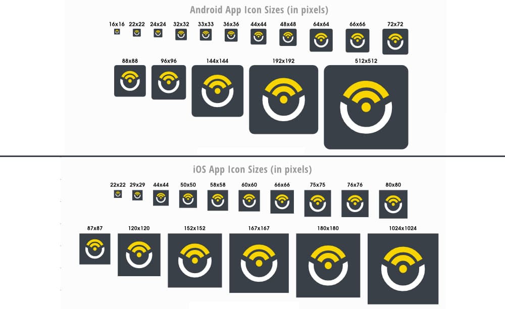
An mobile app icon is a visual anchor of your mobile application with which you first interact on your apps tray. It is not a logo of your brand while the logo and icons are mostly the same but comes under a lot of different restrictions. Logos are branding objects for marketing purposes and often designed for letterheads, and billboards. On the other side, icons are customized to fit into a square canvas, at specific sizes, and in specific contexts. The size of icons can range from 29 x 29 pixels to 1024 x 1024 pixels. These can be used in many contexts where the user can encounter the mobile application including App Store, or Google Play, Settings panel, search results, or home screen.
Attracts More Users from The App Store:
If you are not an already built brand, then the icon of your app will be a significant factor for the number of downloads in your app. Using an attractive app icon, you would be able to gain the wandering users who are seeking the services you provide. But remember, attractiveness for one person might not be the same case for another. Therefore it’s not just about making a flashy icon that conquers all. Instead, the mobile app icon should attract a wide range of audiences. A user first sees the icon then the number of downloads.
Check the Current Design Standards:

You must not be aware of this but apart from the submission size of the app icon, both PlayStore, and Apple’s App Store have guidelines of how they want your app to look, and it is definitely right to follow them. The apps which have followed those guidelines have definitely got more number of downloads.
Recently, Google has implemented the Material Design, which comes with guidelines for creating a better visual interface. In fact, it aims to make users feel if they are interacting with the pseudo physical materials just by some pixels. Google has released a complete comprehensive document for that. Click here for the guidelines.
Apple has also introduced similar guidelines called Human Interface Guidelines. These are quite handy for the iOS developers but are not in as much depth as like of Material Design. Here are the Apple Guidelines…
Showcase the Look & Feel of your App:


You have already understood what I was going to say. The icon of your app should showcase the look & feel of your app, thus the user could understand where he is heading in. So if you are having an app which is an On-demand taxi booking application, then a simple icon of a car wouldn’t be bad (if you are not an established brand).
If the design of your app is flat, your app icons should be flat. If it contains skeuomorphism, then you can include a bit of skeuomorphism, and if it follows the guidelines of Google on Material Design, then the icon should too.
Read more: Flutter Vs. Kotlin: Who will rule the cross-platform market?
Make it Scalable:

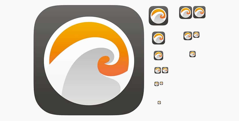
You are going to use the icon of your app on several throughout the platform and obviously at multiple sizes. Thus, it is important that it should have a similar structure throughout all places such as App Store, Retina devices, or in the settings of your mobile, and most importantly, at the App’s tray.
Making your icon too complex can deteriorate its scalability. Hence, rather make it simple which is easy to adjust for small as well as big sizes. The best approach is to work on a 1024 x 1024 size. Prefer a unique shape or element that retains its contours and qualities when scaled. It should look good with different backgrounds.
Easy to Recognize:

The design of the app’s icon begins with a target user of the mobile application to be. You should have a good understanding of the target audience of your mobile application and then use this knowledge in the designing of the app’s icon including color, contrast, shapes etc.
While you work with the mobile application design, don’t forget about its icon. You need to analyze how the user will connect to it, on both functional and emotional levels. It should be able to demonstrate your app’s core value and make an emotional touch with the user.
Maintain Consistency:
The icon of your app creates a mark on the user’s memory. Henceforth, you need to be consistent throughout the design of your mobile app within the product, as well as outside the product. Think of all different platforms where the user can encounter with your app including Play Store, App Store, Website, Social media channels, even outside-product user onboarding, etc. You need to show a unified image of your app across all the channels.

For the Android application, the icons are mostly in size 96 x 96, 48 x 48, 36 x 36 depending on the device. However, Android recommends going for the size of 864 x 864 for easy tweaking. The icons must be saved as PNG files.
For the iOS application, the size should be 1024 x 1024. Alike, Apple the icon gets resized as per the device. The icons must be saved as PNG files.
Wrapping Up:
At Amplework, the best mobile application development company, we took care of the slightest thing of your app. We have highly experienced mobile application developers, QA, and digital marketing experts, who can help you from development to marketing.